
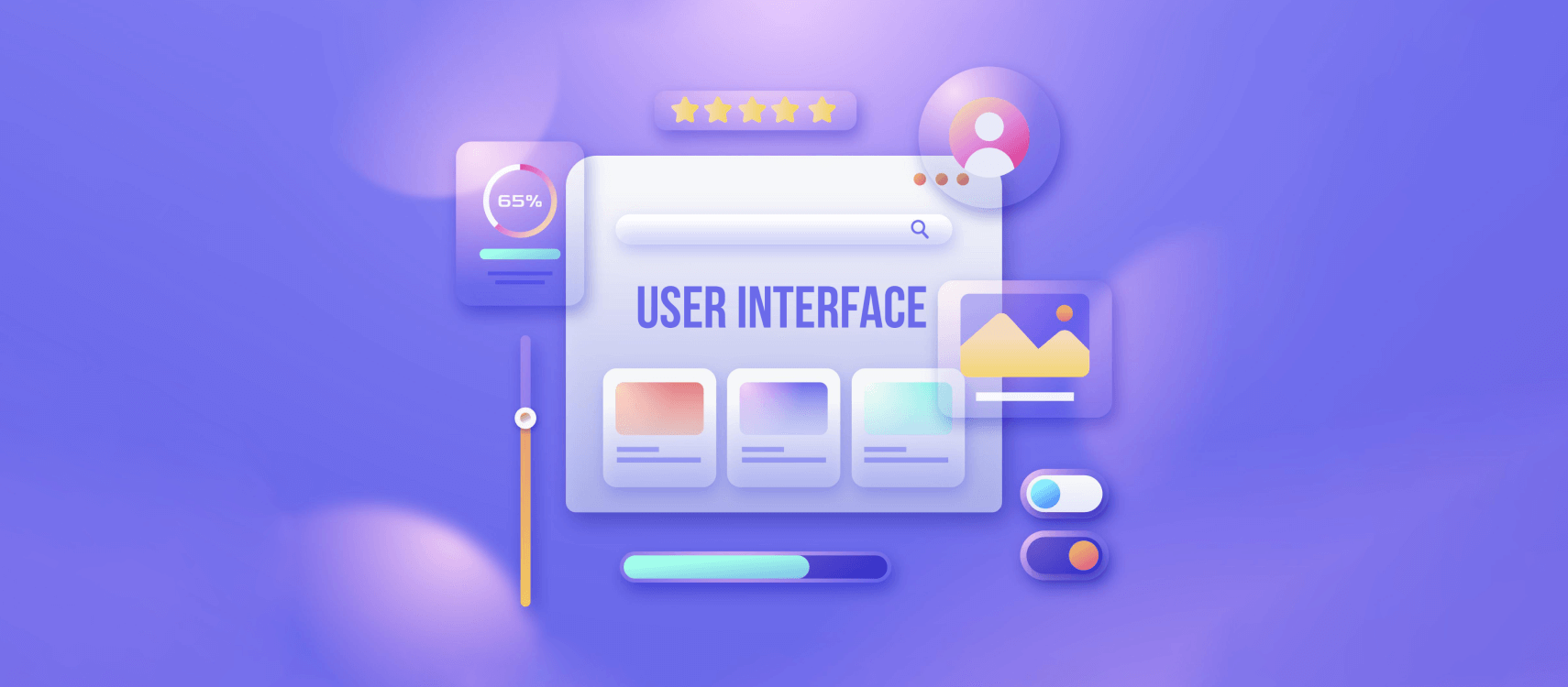
- What Is a User Interface (UI)
- Types of User Interfaces
- History of UI
- The Hidden Science of UI Design
- UI vs. UX
- Mobile User Interface Important
- Ending Notes
- FAQs:- User Interface
If you have ever spent 20 minutes staring at a smart thermostat and have become baffled, not knowing what to do next, you already have the experience of a bad user interface. The sleek touchscreen of the thermostat might look like something straight out of a sci-fi movie, and you couldn’t figure out how to lower the temperature. Maybe you started to think if it’s a problem with the hardware, or the Wi-Fi? No, nothing of that sort. The issue is with the user interface (UI), a poorly designed menu that hides settings behind three cryptic icons. At that moment, I learned something important, and it is that the UI isn’t just about aesthetics. It’s the difference between feeling like a tech wizard or a frustrated toddler.
If you’ve ever tapped the wrong button in a panic, struggled with a clunky app, or marveled at how effortlessly your favorite tools just work, you’ve experienced the power and pitfalls of user interfaces. But what exactly is a UI, and why does it matter so much in our daily lives? Let’s unpack this unsung hero of the digital age.
What Is a User Interface (UI)?
A user interface (UI) is the space where humans and machines interact. Think of it as a shared language: you input a command, the system responds, and the cycle repeats. But unlike learning French or Mandarin, a good UI requires zero fluency from the user. It’s designed to be instinctive, almost invisible.
Let’s explain this with a simple analogy:
Suppose you are walking into a coffee shop. The menu board, the counter, and the barista’s smile all constitute part of the interface that helps you order a coffee. If the menu is in a language you don’t understand, the cash register is broken, or the barista ignores you, the experience falls apart.
Digital UIs work the same way. Buttons, icons, voice commands, and even the swipe left gesture in apps like Tinder are all part of this silent conversation between you and the machine.
What Are the Different Types of User Interfaces?
User interfaces shape how we interact with technology every single day, often without even realizing it. Think about the last time you used an ATM. Maybe the screen guided you with simple buttons, the keypad beeped with each number you pressed, or the card slot lit up when your cash was ready. All of that is intentional design. A good UI gives you the feeling that the device just makes sense.
Some interfaces even adjust to your situation. Open Spotify in your car, and the layout becomes bigger, cleaner, and safer to use while driving. That’s UI adapting to real-world behavior.
Below are the major types of user interfaces you’ll encounter, each built for different kinds of interactions.
1. Graphical User Interface (GUI)
If you’ve ever used a laptop, smartphone, or desktop computer, you’ve already spent hours with a graphical user interface. GUIs rely on visual elements, icons, menus, windows, and buttons to help you navigate information and complete tasks.
On computers, you might use a keyboard and mouse. On tablets and touch-enabled laptops, you use your fingers or a stylus. GUIs are popular because they’re intuitive and let users see exactly what they’re doing.
With more devices becoming touchscreen-friendly, the traditional GUI continues to evolve, but it remains the most familiar interface for most people.
2. Touch User Interface (TUI)
Touch user interfaces are built for tapping, swiping, pinching, and scrolling on a touchscreen. They focus heavily on spacing, button size, layout simplicity, and easy readability because fingers aren’t as precise as a mouse pointer.
Touch UIs aren’t just on phones. You’ll also see them in:
- ATM screens
- Car dashboards
- Kiosks
- GPS systems
Touch interfaces completely changed how we interact with technology by simplifying input and making interactions more direct.
3. Mobile User Interface (MUI)
A mobile UI is designed specifically for smartphones. While it includes the touch-based elements of a TUI, it has its own unique needs, like working smoothly on smaller screens, maintaining battery efficiency, and responding instantly to gestures.
Mobile UIs also take advantage of features built into phones, such as:
- GPS
- NFC
- Biometrics (fingerprint, Face ID)
- Motion sensors
These features allow apps to deliver personalized, fast, and seamless experiences tailored for on-the-go usage.
4. Voice User Interface (VUI)
Voice interfaces allow you to talk to your devices and get responses without touching anything. Thanks to major advances in natural language processing, VUIs are now part of everyday life.
You’ll find them in:
- Smartphones (Siri, Google Assistant)
- Smart speakers (Alexa, Google Home)
- Vehicles (hands-free calling, navigation commands)
- Smart home systems (lights, thermostats, locks)
Voice interfaces shine in situations where your hands or eyes are busy. They’re especially helpful for accessibility, multitasking, and home automation.
5. Gesture-Based Interface (GBI)
Gesture interfaces use cameras or sensors to read physical movements like waving your hand, turning your head, or moving a controller to trigger actions.
These became mainstream with gaming systems such as the Nintendo Wii, and later with VR/AR technologies like Oculus and PlayStation VR.
Today, gesture-based interfaces are used for:
- Gaming
- Virtual and augmented reality
- Fitness and motion tracking
- Touchless controls in smart devices
Because gestures mimic natural human movement, they create more immersive experiences without the need for traditional controllers.
A Brief History of UI and Its Evolution
To appreciate modern UI design and the way it evolved and continued to improve over the years, let’s look back and recognise the milestones.
UI in 1940s to 1960s: The Early Age of Computing
Early computers relied on punch cards and command-line interfaces (CLI). Users typed text commands like RUN PROGRAM, a system so unforgiving that a single typo could crash the entire operation. This era was dominated by engineers and mathematicians; the average person couldn’t interact with machines without years of training.
UI in 1980s: The GUI Revolution
Everything changed when Xerox PARC introduced the graphical user interface (GUI) in the 1970s, later popularized by Apple’s Macintosh in 1984. Suddenly, users could click icons, drag files into folders, and navigate menus. The mouse became the bridge between human intent and digital action.
UI in 2000s: Touchscreens and the Smartphone Boom
Steve Jobs’ 2007 iPhone demo wasn’t just about making calls; it redefined UI forever. Touchscreens replaced physical keyboards, and multi-touch gestures (pinching, swiping) turned glass slabs into intuitive tools. Apps like Uber thrived by prioritizing simplicity and ease of use. When you see a photo, it just needs a double-tap to like. If you need a ride, all you need is press just one button for booking.
UI in the 2020s and Beyond: Voice, Gestures, and AI
Today, we’re entering the era of zero-UI, interactions that feel seamless. Ask Alexa to play a song, wave your hand to scroll through a Tesla’s touchscreen, or use ChatGPT to draft emails through conversation. What do you think is the next frontier? Well, brain-computer interfaces (BCIs) like Neuralink now promise to turn thoughts into actions.
The Invisible Science Behind Great UI Design
Good UI design isn’t about making things pretty. It’s a mix of psychology, ergonomics, and empathy. Here’s what happens behind the scenes.
- The Psychology of Choice
Did you ever hear of Hick’s Law? It states that the more choices a user has, the longer it takes to decide. Great UIs minimize this cognitive load. Take Google’s homepage, for example. What we see after opening is a logo, a search bar, and two buttons. There are no distractions and no confusion for the users here.
- Designing for Intuition
An affordance is a visual clue that hints at how something works. A raised button on a screen looks pressable. A slider control, on the other hand, tells you to adjust. When Spotify uses a green play button with a triangle shape, it actually borrows the universal symbol from DVD players and stereos. Users in this way don’t need instructions; they instantly recognize the pattern.
- Feedback Loop
When you tap a button on your phone, it changes color or vibrates. When Siri hears a command, it chimes. There are many examples of feedback across the user interfaces. It is a way for the UI to say, I’ve heard what you say. Without such feedback, users just hang on and become frustrated,
- Designing for Everyone
Do you know, around 15% of the global population lives with at least one type of disability? This is why a great UI must address the difficulties of all users. Here are some ways you can design for everyone.
- Color contrast for the visually impaired
- Voice navigation for motor-impaired users
- Subtitles for the hearing impaired
Companies like Microsoft have now incorporated accessibility checkers directly into design tools like Figma.
UI vs. UX: What’s the Difference and Why It Matters?
UI (User Interface) and UX (user experience) often overlap each other and work together hand in hand, and this is why people often confuse them. But both of them represent distinct disciplines.
- UI is the tool, and for example, the buttons, layouts, and visual elements are UI elements.
- UX is the journey of the user while using the UI. UX depends on how smooth, efficient, and enjoyable users feel while using the interface.
For example, while using Disney+ or any other streaming app, you can tap on the play button, click on genre categories, and type in the search bar. These are all UI attributes. Now, how quickly the app loads, how accurately the “Continue Watching” section shows the previously watched content, and how many clicks it takes to find your favourite content, are all UX attributes.
This is why a visually engaging UI can’t save a compromised or underperforming UX. On the other side, even the most seamless UX feels lacking vitality with an outdated UI. The real good thing happens when both align.
We’ve all encountered UIs that make us want to scream. Here are red flags:
- Confusing navigation where buttons come with unclear labels.
- Tiny touch targets or buttons often make users hit the wrong button.
- Too many notifications, like multiple pop-up messages, as soon as you open an app.
- Inconsistent design of menus or other elements that change layout in different screens.
Why is a Good Mobile User Interface Important?
A great mobile user interface isn’t just about making an app look nice; it’s about creating an experience that feels effortless from the very first tap. On mobile, users are constantly switching between apps, juggling notifications, scrolling, and multitasking. That means you have only a few seconds to convince them to stay. If your interface feels confusing, slow, or visually cluttered, they’ll close it instantly and move on to something else.
A strong mobile UI solves this problem by making every interaction feel smooth and intuitive. Clear navigation, readable text, meaningful icons, and well-placed touch elements help people get where they need to go without thinking. When an app “just works,” users build trust with it, and that trust turns into loyalty. They return more often, spend more time inside the app, and eventually associate your product with reliability and comfort.
But good mobile UI goes beyond convenience. It affects how users feel while using the app. When actions respond quickly, screens flow naturally, and everything appears right where it should be, the experience becomes enjoyable. People don’t feel frustrated or lost; instead, they feel confident and in control. That emotional connection is what keeps them coming back, not because they have to use the app, but because they want to.
In today’s world, where every brand competes for attention on a small screen, a polished, thoughtful mobile interface can be the difference between an app people delete and an app they rely on every day.
Ending Notes
Next time you unlock your phone, order groceries online, or even use a microwave, take a second to notice the UI. UI designs shape how we work, connect, and navigate the digital world around us. Remember, the best UIs don’t just solve problems; they work in the background like a good font while we concentrate on the content and take actions that matter to our purpose.